 RSS Feed
 Twitter
 11:31
11:31
 Executive Republic
culled from:nngroup.com
1. Provide Access to a Full Shopping Cart
Providing a page in the checkout flow that is dedicated to displaying the full cart helps users make their purchase decisions. They can use the cart to review their selections, check details, compare items, and even finesse totals to meet budgets or qualify for discounts.
Providing a page for the shopping cart, as is done on Chicos.com, gives the users a chance to focus on the cart before starting the checkout process.
Having a full shopping cart would hardly have been necessary as a usability guideline in the old days where everybody did so, but today we need to tell designers to do so. Some sites only allow users to view the shopping cart in a minicart view that appears as an overlay or as part of the checkout process, but not as a dedicated page. For many users, that approach is fine. However, for shoppers who are trying to consider a purchase or make a decision, this can make decision making more difficult, as the cart is relegated to a small area of the screen.
Minicarts give users quick, but limited, access to information about what is in the cart. They are typically small and only display a few items at a time. They force the shopper to do more work to see items in the cart, and make comparison between items more complicated, as users need to scroll the small area of the screen.
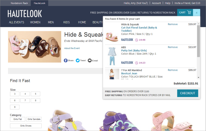 Hautelook
provided a minicart view of the shopping cart to users who clicked on
the Cart icon on the page. This view displayed 2.5 items, requiring
scrolling to see any additional items.
Hautelook
provided a minicart view of the shopping cart to users who clicked on
the Cart icon on the page. This view displayed 2.5 items, requiring
scrolling to see any additional items.Sites that only offer this minimal view of the cart often move users directly to the checkout process when ready to purchase, rather than providing a page with a dedicated view of the items in the shopping cart. The cart, if displayed at all, is shown in only a small section of the checkout page. This can cause the same problems as the minicart and can make comparison more difficult.
The minicart pattern also eliminates the step in the shopping process where users can confirm what items are in the cart and make any edits, selections, or deletions. Editing the cart becomes secondary to proceeding through checkout, and as such, may become a distraction during the checkout process. Users may realize that they have items they no longer want in their cart as they reach order confirmation pages.
Within a checkout process, sites need to keep the focus on purchasing, eliminating distractions that might keep the user from making a purchase. Providing a separate, dedicated shopping cart page can help keep the user more focused during the checkout process. The shopping cart is then where the user makes the purchase decision, allowing the user to focus on completing the purchase (rather than editing the cart) in the checkout flow.
 There
was no Shopping Cart page on Hautelook. Shoppers could only view the
minicart or start the checkout process, where a view of the cart was
displayed as part of the process.
There
was no Shopping Cart page on Hautelook. Shoppers could only view the
minicart or start the checkout process, where a view of the cart was
displayed as part of the process.2. List Product Details and a Clear Product Image
Because shoppers are making final purchase decisions in the cart, it is essential that the cart clearly summarizes the items in it. In the cart, include product images that are large enough to show some details, allowing the shopper to differentiate an item from other similar items that he may be considering. Include the product name and any attributes that the user selected, such as size and color, along with the price. Clearly showing these details helps shoppers remember and compare items in the cart. Cablelas.com listed the name, size, and color of each item next to a clear picture.
The product image is essential. The image helps users who are using the cart to comparison shop. Images also assist users who aren’t comparing items, by reminding them what is in the cart and acting as a quick visual summary. Some sites offer no images and others offer images so small, they might as well not offer them. If a user can’t identify an item, let alone compare an item, based on the image, the image does not add to the usability of the site.
 Product images in Levi’s shopping cart were so small, it was impossible to identify an item based on its image.
The image needs to reflect the users’ selections. Showing the item in the wrong color or with the wrong options, even if the correct color or options are listed in accompanying text, causes users to doubt the selection is correct.
 Boscovs.com
included product images, but it displayed the products in the wrong
colors. The blue shirt shown above is supposed to be dark heather gray,
and the red sandals are supposed to be navy blue. This inconsistency
causes confusion and makes users doubt the trustworthiness of the site.
Boscovs.com
included product images, but it displayed the products in the wrong
colors. The blue shirt shown above is supposed to be dark heather gray,
and the red sandals are supposed to be navy blue. This inconsistency
causes confusion and makes users doubt the trustworthiness of the site.3. Link Users to Full Product Details
When shoppers need additional information to make a purchase decision, they want to return to the product page in order to read more information or review product details. As such, it is important that sites provide users with quick access from the cart to the product detail page. Linking both the product name and image help users quickly and easily access additional product information.
From the shopping cart on the Gap’s site, users could click either the product name or the product image to return to the product detail page.
Users need to know that they can click on a product in the cart to see more information. Indicate that product names are links. Many sites rely on a response to a hover to indicate that the product name can be clicked, but this requires that the user guess that the item can be clicked in the first place. Using a different color or text presentation for links, such as the blue text in the example from the Gap shown above, helps users know that they can easily navigate to product information if needed.
4. Let Users Easily Remove Items — Including Setting Quantity to Zero
While it may seem contrary to the goal of selling more on an e-commerce site, it is essential that a shopper can quickly and easily remove items from the cart. For shoppers using the cart as a holding area, there may be several items in the cart that will ultimately not be purchased. A noticeable, quick, and easy way to remove items works to indicate that users can easily edit the cart and also allows them to do so when needed.A clear link, such as Remove Item, works well for users. Such links clearly indicate what users can do. Delete is slightly less clear for users because it reflects more of a technical view of shopping. They can typically understand it, but shoppers don’t think about deleting items — programmers think about deleting items. Remove is a more familiar term from a user perspective.
Some users also want to set the quantity to zero and update the cart. Many sites prevent users from doing this, either by using a drop-down for quantity that does not include the number zero or by returning an error if the user attempts to make the change. Sites should allow users to change the quantity to zero as an alternate way to remove an item.
 Adidas.com
provided clear links to remove each item. However, users could not set
the quantity to zero and update the cart to remove an item.
Adidas.com
provided clear links to remove each item. However, users could not set
the quantity to zero and update the cart to remove an item.
 Posted in
0 comments:
Post a Comment